Time-series chart
The time-series chart sits above the results grid in Explore. It plots the count of records from your current query (or an aggregation you choose) bucketed over time. The chart updates as you adjust the query, filters, or time range and is available on both the logs and spans datasets.
Use the chart to:
- See a spike, drop, or sustained shift in volume at a glance.
- Spot anomalies that warrant drilling into the underlying rows.
- Compare grouped series (for example, log count by severity, or span count by service) side by side.
For aggregated, non-time-bucketed views, use the Overview tab instead. The time-series chart and the Overview tab share the same query but answer different questions: trend over time versus shape across groups.
Configure the chart
Hover over the chart to reveal its toolbar, then open the graph settings to show the configuration popover. Every control in the popover applies as soon as you select it, and the chart behind the popover updates live as a preview, so there are no Apply or Cancel buttons. Select anywhere outside the popover to close it.
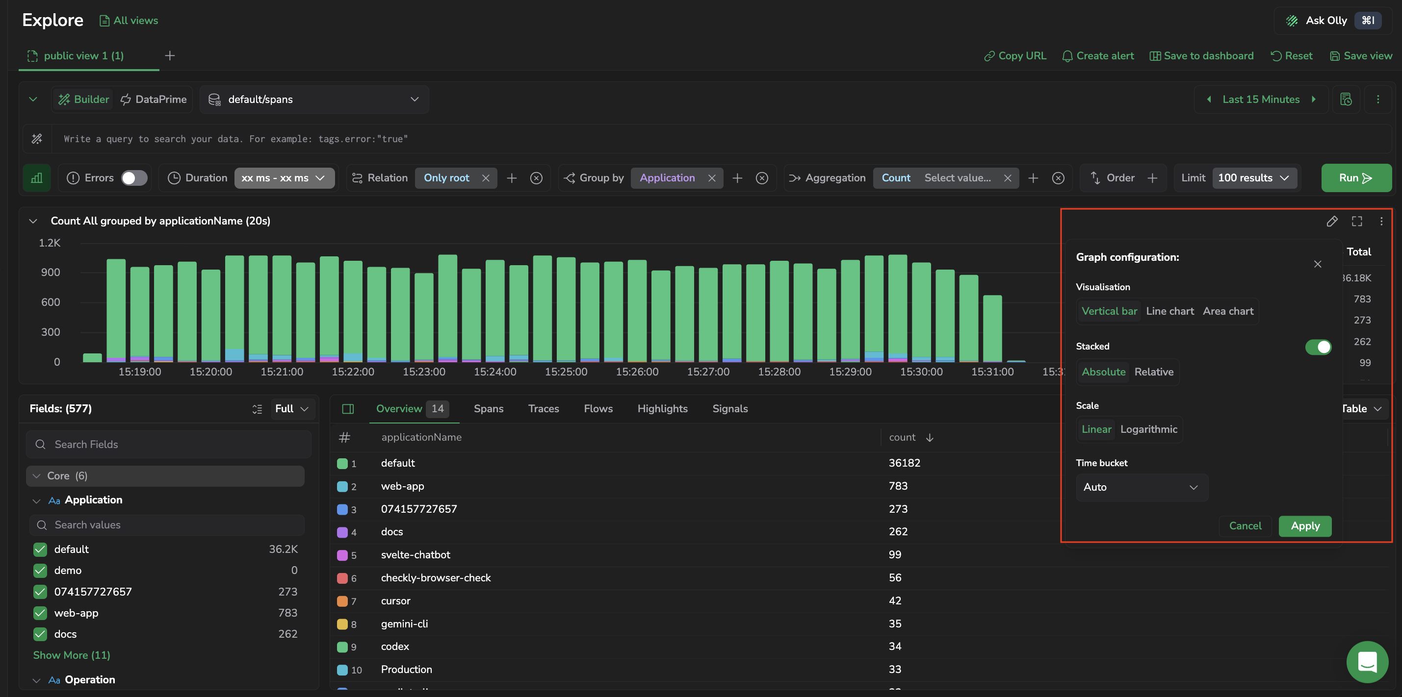
Chart type
Toggle between three chart types:
- Bar: bars along a time axis. Use this to compare discrete buckets and spot peaks.
- Line: points connected by a line. Use this for smooth trend visualization across many buckets.
- Area: a line chart with the area below the line filled. Use this to emphasize cumulative volume.
Switching the chart type resets Stacking to that type's default. See Stacking.
Scale
Choose Linear or Logarithmic for the Y-axis. Use logarithmic when your data spans several orders of magnitude and smaller values are difficult to see on a linear scale.
Time bucket
Control the time interval used to group data points. Choose Auto to let Coralogix pick an interval based on the selected time range, or pick a specific bucket size: 1 Minute, 5 Minutes, 15 Minutes, 30 Minutes, 1 Hour, 2 Hours, 6 Hours, or 1 Day.
Aggregation
By default, the chart plots a count of records per bucket. Use Aggregation and Aggregation Field to plot a different metric, for example, avg of a duration field, or p95 of a latency field. The Aggregation Field selector searches numeric fields only.
Group graph by key
Optionally pick a field to split the chart into one series per distinct value. Each bar or line then represents one group (for example, one series per severity, application, or service).
If the selected field has too many distinct values, the chart shows a Key cardinality is too high warning. Pick a lower-cardinality field or narrow the query first.
When a grouped field has more distinct values than the chart draws individually, Explore folds the remaining groups into a single Other (N) series, where N is the number of grouped-together values. This keeps the chart complete: without it, time buckets whose data belongs only to those lower-ranked groups render as empty, making the chart look like it has gaps where data actually exists. The Other series appears only for additive aggregations (Count and Sum), where combining groups produces a meaningful total. It isn't shown for aggregations that can't be summed across groups, such as average, minimum, maximum, median, and percentiles.
Stacking
For a grouped chart, Stacking controls how the per-group series are drawn. It has three modes:
- Individual: each group's series is drawn on its own, not stacked.
- Absolute: series are stacked, each segment keeps its real value, and the stack height is the sum across groups.
- Relative: series are stacked and each segment is shown as a share of the bucket's total, so every stack fills the full height and you compare proportion rather than volume.
Each chart type has a default stacking mode: Bar starts at Absolute, and Line and Area start at Individual. Switching the chart type resets stacking to the new type's default rather than carrying your previous choice across. This keeps a Relative setting chosen for a bar chart from silently becoming a 100%-normalized area chart when you switch to Area.
Absolute and Relative stacking are available only for additive aggregations (Count and Sum); they aren't available for aggregations that can't be summed across groups, such as average, minimum, maximum, median, and percentiles.
Legend
Choose where the chart's legend appears, or hide it:
- Side: list the series beside the chart.
- Bottom: list the series below the chart.
- Hide: hide the legend to give the plot more room.
Sync with main query
When enabled, the chart respects every filter and grouping in the main query, so the chart's series match exactly what the results grid shows. When disabled, the chart configuration runs as a side query independent of the main query, useful when you want to keep an overview chart in view while drilling into a narrower subset of rows.
Collapse the chart
Select the chevron in the chart header to collapse the chart to a single row and give the results grid more room. Select it again to restore the chart.
A collapsed chart still summarizes itself. The header shows a strip of pills, one per series, covering the top six series by count, so you keep the shape of your data while you read rows. Where the chart folds lower-ranked groups into an Other series, that series takes one of the six slots. As the container narrows, pills drop their labels and keep their counts.
The chart's actions stay reachable from the more-actions menu in the header: Configure, Full view, Ask Olly about this chart, Copy Graph image, and Export Graph as PNG. Each one appears only where it applies to the current chart.
Interact with the chart
- Hover any bar, line point, or area segment to read its exact value and bucket interval.
- Drag across a region to zoom into that time range. The time range picker updates to reflect the selection and results refresh automatically.
- Select a data point to open a context menu with Drilldown (open the rows that contributed to that value), Include in query / Exclude from query (add the value as a filter), and copy actions. In Builder mode the filter is added as a Lucene clause; in DataPrime mode it's appended to the query as a DataPrime
filterclause so you can iterate on a DataPrime pipeline without rewriting it.
Version Benchmark markers
When your account uses Version Benchmarks, the chart marks each Version Benchmark tag on the time axis with a badge. Use these markers to line up a shift in your data with the version or event that preceded it.
- Hover a badge to read the tag in the chart tooltip.
- Select a badge to open that tag's Version Benchmark comparison (the tag against the one before it) in a new browser tab.
Markers appear only if you have permission to view Version Benchmark tags (VERSION-BENCHMARK-TAGS:READ).
Ask Olly about the chart
Select Add to Olly context in the chart toolbar to pin the chart to an Olly chat and open the Olly drawer. Olly receives the chart's query and grouping, so you can ask why a series spiked, which group is driving a trend, or how the current shape compares to another period. The chart is added as a removable chip in the prompt. See Page and data context for chip behavior and removal.
Related resources
- Overview tab, aggregated tables and charts for non-time-bucketed groupings.
- Query Builder. Build the query that drives the chart.
Next steps
Interpret and resolve the messages Explore shows when a query fails or returns warnings in Errors and warnings.