Line charts
Create a customized line chart in Custom Dashboards to visualize logs, metrics, and spans.
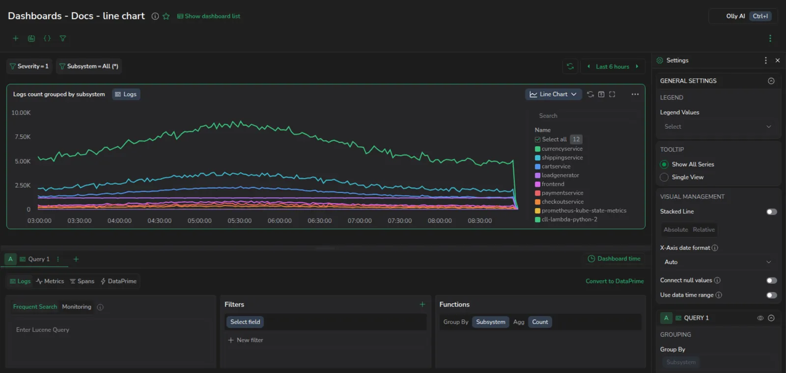
Getting started
To add a widget to a custom dashboard, click the + icon. Then, drag and drop the line chart widget from your left-hand sidebar.
Use the Query Builder to create a query
In the bottom panel, build your query using Query Builder.
Define the widget parameters
Define the parameters for your widget in the right-hand sidebar.
General settings
Legend values: Customize values to be displayed in your legend: Min, Max, Sum, Avg, Last.
Tooltip: Select whether to see all time series when hovering over them, or to see only the single time series you hover over.
Stacked line: Stacking allows you to layer time series on top of each other, offering insights into the overall trend over time and the individual contribution of each series to that trend. In a stacked line chart, instead of having separate lines for each series, the series values are stacked on top of one another at each time point. This allows viewers to see the overall trend over time and the contribution of each series to that trend.
Toggle to activate, then choose from one of the following:
-
Absolute: Stacks series on top of each other.
-
Relative: Stacks by percentage where all series add up to 100%.
Stacking needs one shared y-axis, so while it is on every query adopts the first query's axis: its unit, scale, and min and max. A query whose unit belongs to the same family as the first one is converted into that unit before it is stacked, and its tooltip and legend values follow suit. A query in an unrelated family, such as bytes stacked onto seconds, keeps its own values and label, and the resulting total is not meaningful.
Connect nulls: Choose whether the line bridges a gap in the data or breaks at it. Turn it off and a time bucket with no data breaks the line, whichever query language the widget uses. Gaps are detected from each series' own spacing, so a short gap that previously rendered as a straight slope now shows as a break.
Share widget URL: Share a direct link to this widget.
Query parameters
Define your query parameters. If you have configured multiple queries within the Query Builder, define the parameters for each.
Time bucket selection: The time bucket setting determines how data points are grouped over time. It impacts the granularity of the visualization and how trends are displayed.
-
Auto time bucket: When the auto option is selected, the system automatically determines an optimal time bucket based on the selected time range and available data points. This ensures that the chart remains clear and readable without requiring manual adjustments. The system dynamically adjusts bucket size as you zoom in or out.This is ideal for scenarios where data density varies, as it adapts automatically.
-
Manual time bucket: Selecting the manual option allows you to define a fixed time bucket for grouping data points.You can specify the bucket size using predefined time units: seconds, minutes, hours, or days. Use this setting for precise control over how data is aggregated. This is ideal for ensuring consistency across multiple charts or dashboards.
Date format: Select how timestamps are displayed on the axis. The default is Auto, which uses your team's date format settings. Available formats:
| Format | Example |
|---|---|
| Auto | Uses your team's date format settings |
| DD/MM | 25/04 |
| MM/DD | 04/25 |
| HH:mm | 14:30 |
| DD/MM HH:mm | 25/04 14:30 |
| HH:mm DD/MM | 14:30 25/04 |
| MM/DD HH:mm | 04/25 14:30 |
| HH:mm MM/DD | 14:30 04/25 |
Legend management: Select the color scheme for your chart. For details on additional widget customization options, refer to Legend Configuration for Widgets.
Series management: Define your series settings to customize how data is displayed in your line chart.
-
Scale. Choose between a logarithmic or linear scale. By default, the scale is set to linear. However, if your data contains large value differences, a logarithmic scale can improve readability. For example, if most values are below 1,000 but one value is 10,000, a logarithmic scale will provide a clearer visualization.
-
Y-axis min/max limits. Set custom minimum and maximum bounds on the Y-axis of the chart. This allows for consistent comparison across dashboards. When unset, the Y-axis adjusts dynamically to the data range, and the Min and Max fields show that inferred range as a placeholder hint.
To plot a series below the axis, for example to mirror sent against received traffic, multiply the series by
-1in the query itself (... * -1). There is no per-series setting that flips direction.WarningThis changes the stored query, not just the display. A dashboard migrated from another tool no longer matches its source once you do this, and anyone reading the query later sees the negation rather than the metric they expected. Note it in the widget description if the dashboard is shared.
-
Series per query. Define how many data series should be generated from each query.
-
Series name. Assign a custom name to each series for better identification.
-
Connect null values. Decide how the chart draws a time bucket that returned nothing. When disabled, the default, a null leaves a gap in the line. When enabled, the line is drawn straight across the gap to the next point that has data.
Which one you want depends on what a missing point means. If the gap means the service stopped reporting, leave this off, since a connected line invents data that was never measured and hides the outage. If the gap is an artifact of a scrape interval shorter than your time bucket, and the underlying series is genuinely continuous, connecting it reads better. When in doubt, leave it off: a visible gap is a question, a connected line is an answer you may not have.
Units management.
-
Units. Select the unit type to be displayed in your line chart to ensure consistency and accurate interpretation of data.
-
Decimal. Select the maximum number of decimals to display.
-
Precision. Toggle Precision to display fully un-rounded numerical values in your chart. When enabled, data series values shown in the tooltip (on hover) will reflect the complete, raw value returned by the query. When disabled, values are rounded based on the selected Decimal setting.
Widget time range
By default, a line chart uses the dashboard time range for its time axis. To base the time axis on the time range of the data your query returns instead, turn on Use data time range in the widget's Visual Management settings.
Use this for time-shifted queries that modify timestamps (for example, addTime($m.timestamp, 14days)) where the dashboard time range would otherwise leave empty space on the chart.
When you turn on Use data time range:
- The widget's custom time-frame picker turns off, because the time axis comes from the returned data.
- The widget header shows a Data based chip instead of the normal time-frame chip, with the start and end time taken from the data.
To save your dashboard for future use, click SAVE in the upper right-hand corner.
Next steps
Learn how to use data tables in your dashboards.