Dynamic widget

The Dynamic Widget in Coralogix Custom Dashboards automatically analyzes your query results and suggests visualizations based on the shape of the data. Instead of starting with a fixed chart type, you first define the query you are interested in, and the widget recommends the most relevant visualizations for your results.
Start with your data, not your chart
When you first add a Dynamic Widget, it opens in a table view showing raw data in JSON format. This initial state serves as your starting point before you apply query filters, grouping, or aggregation. From there, the widget displays additional suggested visualizations, such as bar charts, pie charts, gauges, line charts, or heatmaps. Whenever you adjust your query, the Dynamic Widget re-analyzes the results and updates the list of recommended visualizations.
This approach ensures that the visualization options always match your data’s shape, reducing trial-and-error and making it faster to find the best way to present your results.
Create a dynamic widget
-
In Custom Dashboards, select Add Widget.
-
Drag and drop the Dynamic widget into your dashboard.
By default, the widget will open with a table view of your data in JSON entries.
-
Build your query in DataPrime or with the Query Builder.
The widget automatically analyzes:
- Dimensions (string fields)
- Values (numeric or aggregable fields)
- Aggregation types you’ve applied
-
Select from the suggested visualizations based on your query.
-
Adjust your query or groupings to explore more visualization options. The Dynamic Widget updates recommendations in real time.
-
Configure additional settings for your chosen visualization in the widget panel (e.g., thresholds, unit precision, stacking options).
-
Select Save changes to add the widget to your dashboard.
After saving, you can change the visualization at any time by selecting the widget and selecting Suggest visualizations to view other chart types for your query.
Example use case
After you add a new Dynamic Widget to your dashboard, you can explore a complete example that analyzes peaks in network request volume and response size using a data table. For the full walkthrough, see Build a Dynamic Table Widget.
Format results in table view
The table view is the initial visualization in the Dynamic Widget. It adapts automatically to the data returned by your query and lets you choose how the data is displayed and formatted.
The table view detects all available fields from your query results so you can decide which ones to display as columns, set their order, and format their values.
- Shape-based and dynamic: The table layout adapts to the structure of your query results.
- Schema-driven: Take fields and data types from your query and use them to define available columns.
- User-defined formatting: You control column visibility, order, and style rather than using preset chips or field types.
Add and organize columns
Select which fields to display, in what order, and how each field is represented.
Use these features to turn raw query results into a clear, readable table.
Expand the Columns section in the widget settings panel to select or clear fields you want to show as columns.
- Use the search bar to quickly locate fields for adding as columns.
- The Columns section lists fields under Selected columns and Available columns. Clearing a column's checkbox (or removing it from the table header) moves it from Selected columns to Available columns; selecting it again moves it back.
- Drag and drop to reorder columns in the Selected columns list or the table header, including to the first position. In the Selected columns list, the whole row is a drag handle, so you can grab a column anywhere along its width. You can also drag a column between the Selected columns and Available columns lists to show or hide it.
- Clear a column's checkbox to stop showing it. The last selected column can't be cleared, and hovering its checkbox shows At least one column must be selected.
Remove a column from the table header
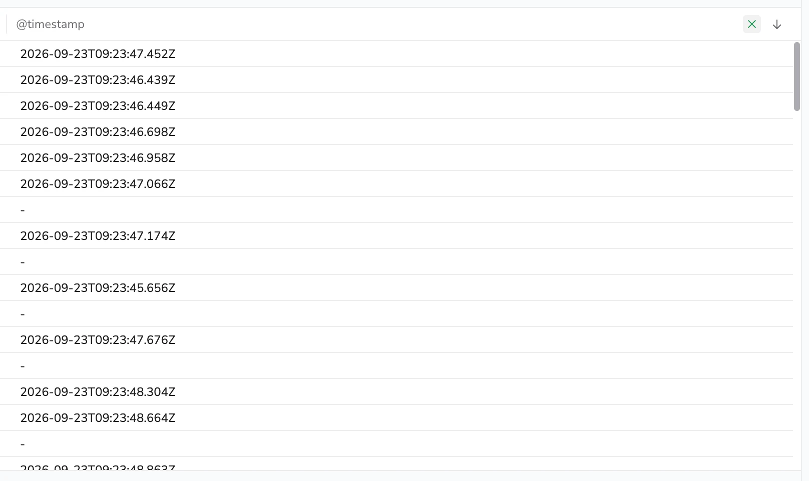
Hover over a column header in the table to reveal a remove button on that header, then select it to drop the column. This does the same thing as clearing the column's checkbox in the Columns section, without opening the widget settings panel.
Removing a column is an unsaved change. Save the dashboard to keep it.
The button doesn't appear on the last remaining column, and it isn't available in Visual Explorer.
Reset columns
Two controls discard your column selection and restore the columns the query produces on its own:
- Reset columns, in the widget toolbar to the right of the search box.
- Reset, on the Selected columns row of the Columns section in the widget settings panel.
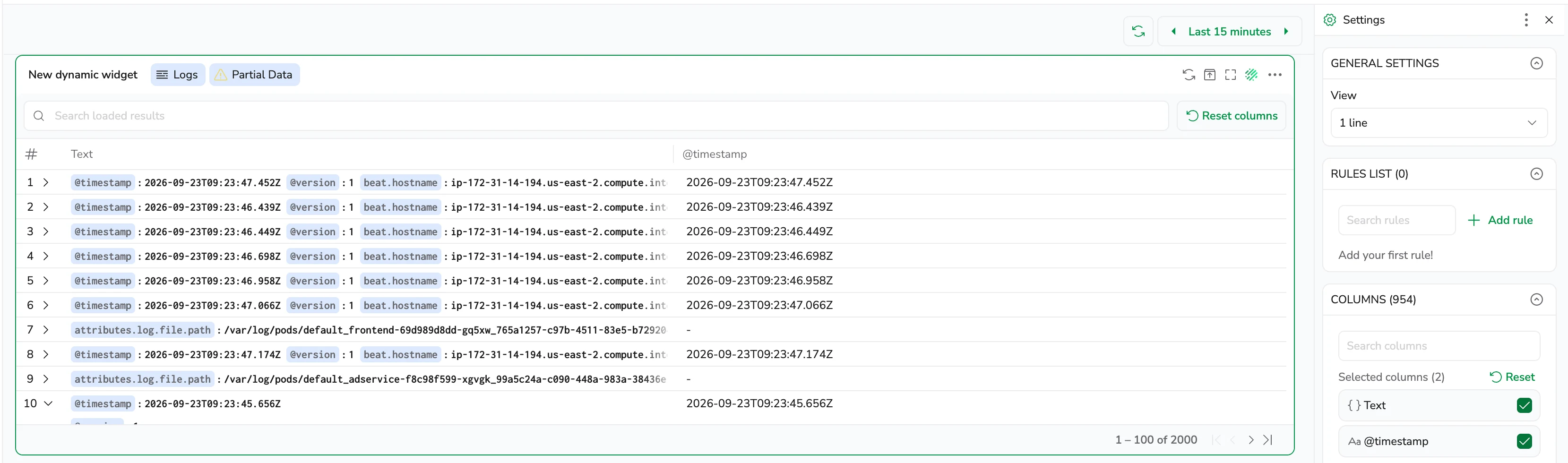
What you get back depends on the query:
- An unprojected query resets to the single Text column.
- A projected query resets to every column in the query's data shape, in the order the query returns them.
Column order is part of the default, so a reset is offered even when you have the same columns selected but in a different order.
Control column display with rules
Rules let you apply shared properties (such as thresholds, alignment, or units) to multiple columns at once.
Use rules to define how multiple columns behave or appear.
- Expand the Rules list in the settings panel and select Add rule.
- Give the rule a clear, descriptive name that reflects its effect on the columns.
- Select which columns the rule applies to. Selecting by Name targets a single column, while Regex and Type match all columns that fit the pattern or data type.
- Add one or more properties to control formatting, alignment, units or value display.
You can also apply a rule to a specific column by opening that column’s more actions menu and selecting Add property.
To remove a rule, select Delete in the rule's more actions menu.
Define rule properties
Each rule can include one or more properties. Properties control how values are formatted, aligned, labelled, or transformed in the table.
Display name
Set a custom column header label without changing the underlying field name or query output.
Use this when:
- A column needs to be more readable or user-friendly.
- Field names are technical, verbose, or inconsistent across data sources.
Behavior:
- Updates only the column header text.
- Does not affect the underlying field name, query results, sorting, or filtering.
- Can be applied to one or multiple columns using name, regex, or type targeting.
Example:
Rename the column header subsystemname to Service.
Thresholds
Color or label numeric values by range.
Use this when:
You want to notice quick visual cues and patterns.
Example:
Color k8_container_restarts_restart values as
- 0–50 = Greed (good)
- 51–80 = Yellow (warning)
- 81+ = Red (critical)
Column alignment
Align text left, center, or right.
Use this when:
You want consistent alignment across many fields.
Example:
Right align numeric columns.
Units
Append symbols or convert numeric values using preset units (e.g, ms, %, or MB) or define a custom unit at the end of the units list.
Units let you control how numeric values are displayed. They include:
- Decimal places: Set how many decimal places are shown.
- Precision: When enabled, show full, unabridged value. Disable to abbreviate and append with a unit type (e.g,
1.2Kb). Disabled by default. - Percentage modes:
- 0-1: Treat values as fractional percentages
- 0-100: Treat values as whole-number percentages
- %(Min-Max): Calculate values based on the range you define
Use this when:
You want to convert raw numeric values into readable units.
Example:
Goal: Show http_resp_bytes in bytes with 2 decimal places.
Setup: Disable Precision, set Decimal to 2, set Units to Bytes
Result: 1027 → 1.01KiB
Regex extract
Define a regular-expression capture group to display only the portion of a value you want. The table shows the captured group instead of the full original string.
Use this when:
You need to shorten long identifiers and keep only the meaningful segment.
Example: Extract only the IP portion of a hostname
Value:
ip-192-168-0-1.us-east-1.compute.internal
Regex:
ip-(?<val>[^\.]+)
Display value:
192-168-0-1
Explanation: The regex finds the ip- prefix and captures only the numeric sequence of numbers and hyphens (the ip-block), using a named capture group called value . Only the captured portion appears in the table.
Value alias
Replace the entire displayed value with a simpler label or interpolated value.
Use this when:
You want to rename or simplify a specific value without regex.
Example:
Replace the value payment-service-v3 with payments.
Value mapping
Map exact values or regex-matched values to custom labels for display.
Use this when:
You want to adjust how values are displayed in the table, including null or missing fields.
Example:
- Map
500toServer Error - Map null values (leave Value field blank) to
"N/A" - Map regex pattern
^5/d/d$to replace 5xx status codes withServer Error
Custom action
Add a clickable link in the cell’s more actions menu to trigger custom actions. The link can open another Coralogix view or an external system, using values from that cell.
Use this when:
- You want to jump to another part of Coralogix while preserving context from the table.
- You want to open external tools or applications populated with data from that cell.
Example:
https://example.com/?service={{$l.subsystemname}}
A link can reference any column shown in the table, not only the column the reader selects. Every column in the clicked row supplies a value, so one link can combine several of them. Where a name appears in more than one place, the selected cell's own value wins.
To build custom links, see Create and Manage Custom Actions.
Delete properties
To remove a rule property, hover over the property, and then select Delete property.
Preview and review applied rules
Each rule displays the number of columns it applies to in the Rules list.
- If a rule applies to one to three columns, their names appear directly in the tooltip.
- If a rule applies to more, the tooltip displays “Applied to N columns.”
Search table results
Use the search box in the widget toolbar to filter rows already loaded in the table. The search is case-insensitive and matches any visible column. It does not trigger a new backend query — only the rows currently displayed are filtered.
To search table results:
- Hover over the widget to reveal its toolbar. The search box sits on the left, with the placeholder Search loaded results.
- Type a search term. The table updates immediately to show only rows where at least one visible column contains the term, and the matching text is highlighted.
- Select the clear icon at the right of the box to drop the search and restore all rows.
Your search term is saved per widget in your browser and is restored when you reload the page.
The search filters only the rows currently loaded in the widget. If your query returns more than 2,000 rows, the data limit applies before the search runs. Use query filters or narrow the time range to reduce the result set.
Sort table columns
Select a column header to sort the table by that column. Each further selection moves to the next state:
- Ascending.
- Descending.
- Unsorted, which returns the rows to the order the query returned them.
Sorting reorders the rows already loaded in the widget rather than rerunning the query, so the data limit applies first. Sorting isn't saved with the dashboard: reopening it returns every column to unsorted.
Number and timestamp columns sort by their underlying value, even when a value alias, value mapping, or regex extract rule changes the text on screen. Text columns sort by the value as displayed, since that's the only value available.
Filter table results with filter in and filter out
Right-click any cell value in the table view to open a context menu with Filter In and Filter Out options. These options let you narrow or exclude data directly from the table without manually editing your query.
- Filter In narrows the table to show only rows where the selected column matches the clicked value.
- Filter Out removes all rows where the selected column matches the clicked value.
Each filter action adds a widget-level filter that works alongside any existing query filters or dashboard filters. Applied filters appear in the widget filter bar, where you can review and remove them.
To filter table results:
- Right-click a cell value in the table.
- Select Filter In to include only matching rows, or Filter Out to exclude matching rows.
- Repeat with additional cell values to refine your results further.
To remove a filter, select the filter tag in the widget filter bar and delete it.
When a column has a value mapping or regex extract rule applied, the displayed value may differ from the underlying data value. The filter uses the original data value, not the displayed label, to ensure accurate filtering.
Narrow the query from the table
Include in query and Exclude from query edit the widget's own query rather than adding a widget-level filter, so the narrowed query is what runs the next time the widget loads and is saved with the dashboard.
- Include in query appends a condition matching the value you selected.
- Exclude from query appends a condition excluding it.
The condition follows the query language the widget uses. A Lucene query gains AND field:"value", and a DataPrime query gains a filter operation such as | filter $d.field == 'value'.
Use Filter In and Filter Out for a quick look you can undo from the filter bar, and Include in query or Exclude from query when the narrower query should become part of the widget.
Neither action appears on a metrics query, which has no editable query text, on a widget you can't edit, or on a column that can't be traced back to a single query.
Work with fields in Text and JSON columns
When a column displays raw Text or JSON data, you can act on individual fields inside it without leaving the table. Select a field's name or value to open a context menu.
Selecting a field name opens these actions:
- Add as a column: adds the field as its own column in the table. Coralogix resolves the column type from the schema.
- Copy full path: copies the field's DataPrime path.
- Include in query and Exclude from query: narrow the widget's own query by that field. See Narrow the query from the table.
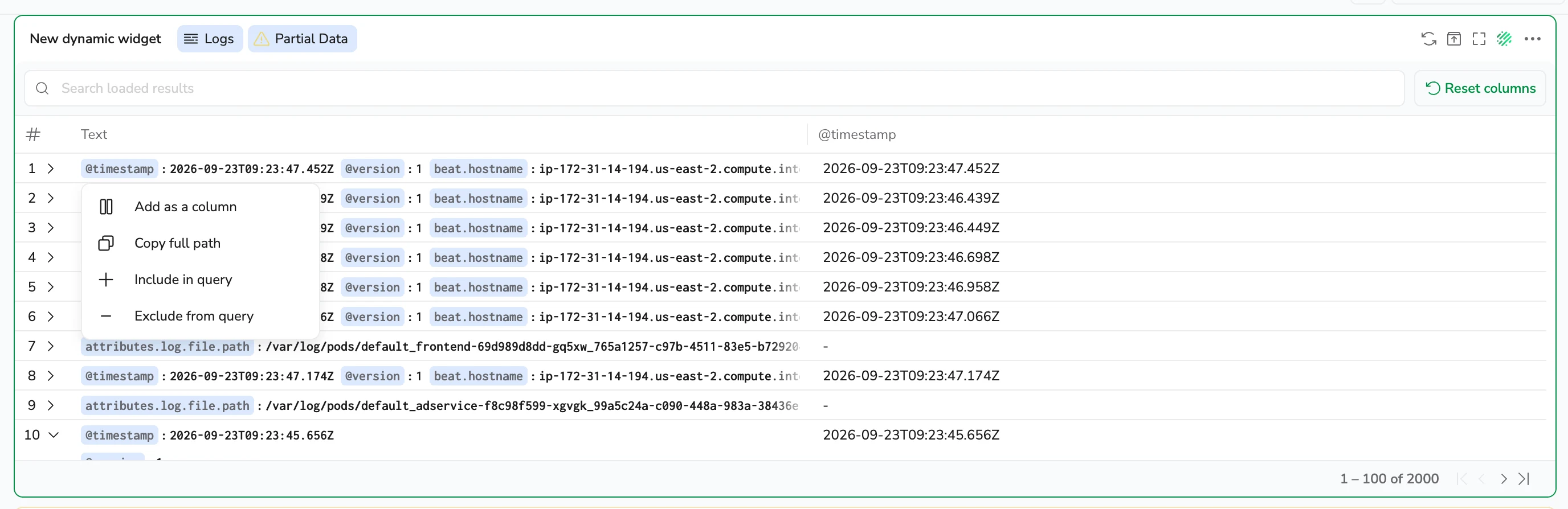
Adding a column is a quick action for investigation. It creates an unsaved change you can undo or redo. The column isn't kept unless you save the dashboard.
Selecting a field value opens these actions:
- Filter in: narrows the table to rows where the field matches the selected value.
- Filter out: removes rows where the field matches the selected value.
- Copy value: copies the field value.
Filter in and Filter out are available only for schema-known, filterable fields with a non-null value. Each filter adds a widget-level filter that appears in the widget filter bar, alongside any query or dashboard filters. To remove a filter, select its tag in the filter bar and delete it.
Limitations
The following limitations apply to filter in and filter out actions in table widgets.
Filters are not added to the URL. Filters applied using Filter In or Filter Out are not reflected in the URL. These interactions are designed for quick, in-session investigation and are not persisted when sharing links. Support for persistent filters via saved states is planned.
Multi-query tables with joins. Filter In and Filter Out are not available when the table is based on multiple queries using joins (for example, an outer join).
Text and JSON views. Cell-level Filter In and Filter Out apply to structured columns. To filter from a Text or JSON column, use the field context menu instead. See Work with fields in Text and JSON columns. Filtering from a field is available only for schema-known fields with a non-null value.
Data limits in Dynamic Widgets
Dynamic Widgets display up to 2,000 records per query result. If a query returns more than 2,000 records, the widget shows a Partial Data notice. The widget includes only the first 2,000 rows returned.
To analyze or export the complete result set, narrow the time range or apply filters to reduce the number of returned records.
Understanding projected and unprojected queries
Some queries return all fields from your dataset, while others return only the fields produced by your query logic. This affects which columns you can manage in the table.
Projected vs. unprojected queries:
- Unprojected queries expose all available fields in your dataset.
- Projected queries show only the fields defined by your query.
Unprojected queries
Unprojected queries return raw records with all available fields. This appears as full JSON entries in the table. Most log queries with filters are unprojected.
For example:
source logs | filter $d.http_resp_status == 500
This query returns a table containing all fields from the matching log records.
Projected queries
Projected queries return a reshaped dataset produced by grouping, aggregating, or joining records.
For example:
source logs
| filter $m.severity == ERROR
| groupby $l.applicationname aggregate count()
This query returns one row per applicationname with a count of error logs. Since the grouping and aggregation define the output fields, the table can display only the applicationname and count columns.
What creates a projected query?
Projected queries result from grouping, aggregating, joining, or applying any transformation that reshapes the original records. The query defines the final set of columns.
Effect on column management
A projected query decides which fields exist, so you can't add a column the query doesn't return. New fields have to come from the query itself. Within the set the query returns, you manage columns exactly as you would for an unprojected query: select and clear them, reorder them, and apply rules to them.
Reselecting a column returns it to the position the query returns it in rather than to the end of the list. Changing the query's fields keeps the choices you already made for the columns that are still present, and places any newly returned field in its query position.
Visualization recommendations
The Dynamic Widget automatically suggests other visualizations that fit your data, such as:
- Bar, line, or area charts for time series-based data shapes
- Pie charts, bar charts, heatmap, polystat or multi-gauge for categorical data shapes
- Gauge or single-value stats for key KPI data shapes
To switch visualizations anytime without rebuilding your query, select Suggest Visualizations.
Export the widget to CSV
You can export any Dynamic Widget visualization as a comma-separated-values (CSV) file. The export contains the same data the widget displays, organized into a simple table so you can use it in external tools or share results with your team.
The CSV reflects the data produced by your query after grouping, filtering, and aggregation:
-
If your widget groups results by service and status code, the exported file includes those columns along with the aggregated values. For example with this DataPrime query:
source logs | groupby $l.subsystemname, $m.severity aggregate count() -
If your widget uses a raw unprojected query (without any grouping or aggregation) the CSV flattens each field in the JSON data into it’s own column, and each row represents one event.
The export includes only the rows currently shown in the widget, up to a limit of 2,000. If your query returns more than 2,000 rows, then your widget will display a Partial Data notice. To export a full set of results to the CSV file, reduce the returned records by narrowing the time range or adding filters.
To export widget data: Open the widget’s more actions menu and select Export widget to CSV.
Related resources
Next steps
Learn how to use the geomap widget to visualize geographical data.